


Layered Lighting, Room by Room
Combine ceiling fixtures or uplights for general glow, shaded floor lamps for reading, and gentle accents on artwork or plants. Avoid bare bulbs that produce glare at eye level. Place seats so light falls from behind the shoulder, not into the eyes, for relaxed conversation without strain.
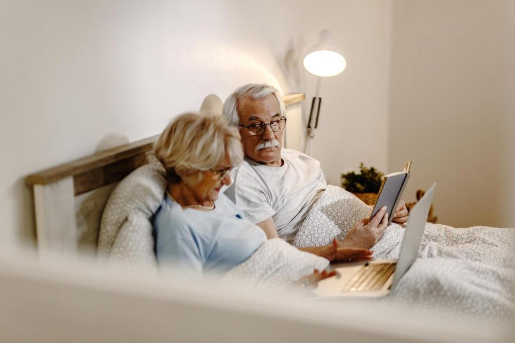
Layered Lighting, Room by Room
Use warm bedside lamps with easy, large switches. Add motion-activated toe-kick or under-bed lights to trace a gentle path to the bathroom. Keep night illumination low, indirect, and amber-leaning so it guides movement without jolting the body awake or disturbing essential deep rest.
Layered Lighting, Room by Room
Install under-cabinet lights to remove risky shadows from countertops. Choose matte worktops that reduce glare and cutting boards contrasting with the counter so blades and food are visible. Light the sink and stove clearly, and keep switches easy to reach for safe, confident meal preparation.